The AfricanTechBro
brand guide
Bold lowercase letters. East African colour. A little overlap, a lot of character. One identity for AfricanTechBro and The ATB Show, built to stay clear wherever it appears.
THE SELECTED IDENTITY
One identity.
Every background.
The compact atb wordmark leads the main brand. The three-line the atb show lockup belongs to the show. Both use the same lettering and star.
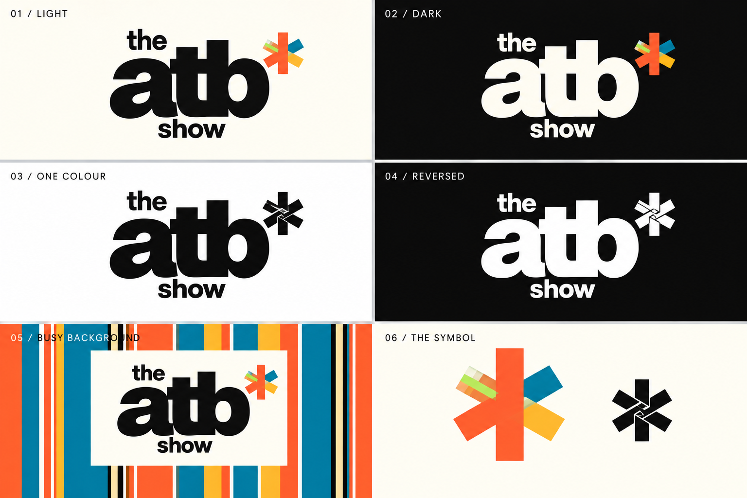
01 / Light
Ink lettering. Full-colour star.
02 / Dark
Cream lettering. Full-colour star.
03 / One colour
Solid black with a clear woven detail.
04 / Reversed
Solid white for dark surfaces.


05 / Busy backgrounds
Give the logo a solid cream or ink backing over photographs and pattern.
See the thumbnail and motion kit ↗06 / The symbol
A kikoi-inspired star. East African roots, carried into a simple modern mark.



THE ATB SHOW · EPISODE KIT
A familiar look.
A signature sound.
Straight, mirrored strips open around a rotating star assembly. The star settles into the show logo as the lettering is revealed. Two guests, one clear promise, and an original aspirational lo-fi beat.
The opening
04 secondsStraight strips split in mirrored pairs. The central bars assemble into a rotating star, then settle into the complete show logo on the 2.67-second downbeat.
Your next move
18 secondsOne action to take, a related episode and a place to subscribe. The same warm musical phrase carries the conversation into what comes next.
THE SOUND
Warm keys.
A brighter groove.
An original 90 BPM lo-fi instrumental: warm major-ninth chords, a rising plucked melody, rounded bass and a laid-back kick-and-snare groove. Swung shakers and soft hand-percussion accents add movement. The opening and closing share the same melody. No vocals or third-party samples.
THE THUMBNAIL · SELECTED DIRECTION
A moment in
the conversation.
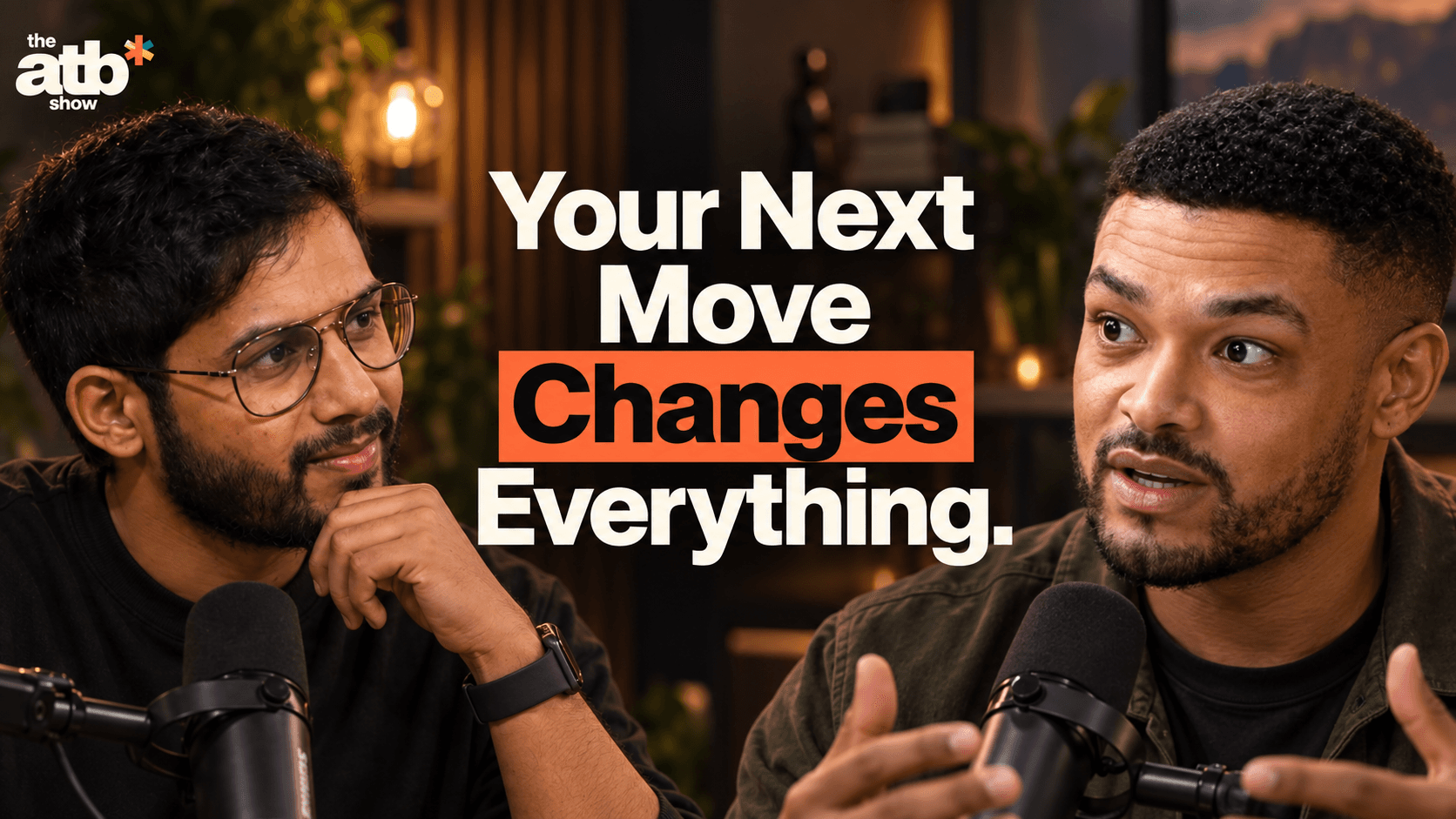
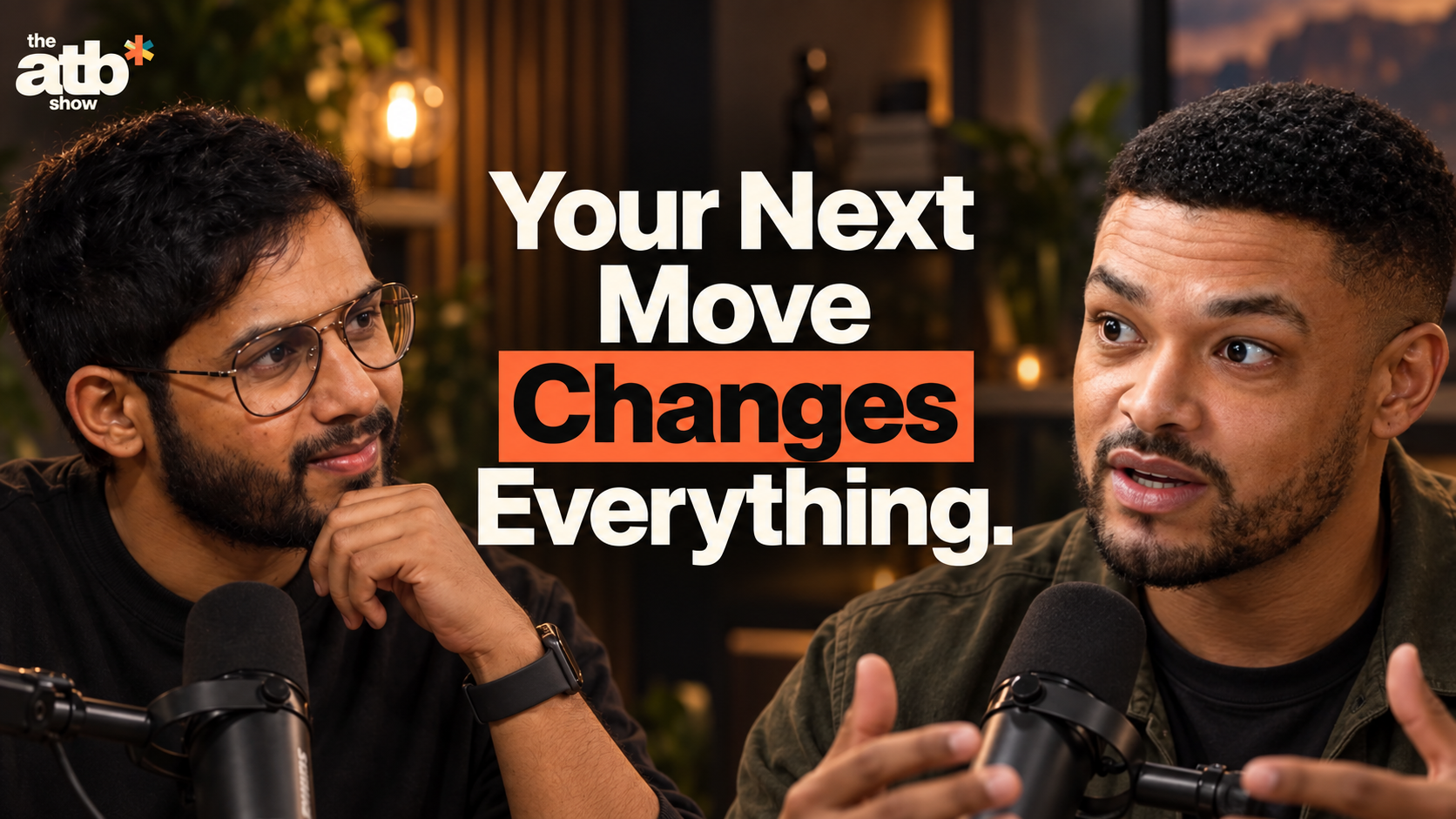
Warm studio light, two expressive close-ups and a short headline. Highlight one whole word in orange, with the same bold type throughout.


THE SCROLL TEST · 320 PX
Both faces. Every word. At a glance.
Show the exchange.Use an engaged listening moment and a speaking moment. Frame both faces inward, with eyes and expressions clear.
Highlight the whole word.Keep one bold typeface. Put a solid orange rectangle behind the key word, with dark lettering and a little breathing room.
Keep the room in the picture.Retain a softly blurred studio background and natural light. Choose a headline the episode delivers.
Created from Akhil’s guest-page studio concept and the supplied Steven Bartlett podcast reference. This AI-assisted illustrative composite is not from a shared recording.
THE ATB SHOW · PARTNER PLACEMENT
Part of the show.
Room for a partner.
The audience comes for the conversation. Give a sponsor a clear, consistent place in it, with ATB leading the identity and one useful message at a time.
Illustrative placement study. Plato is an example name, not an announced partner. Its name is placeholder type, not an official logo. Conversation images are AI-assisted examples.
OPTIONAL · PRESENTING PARTNER
The conversation still leads.
A compact sponsor credit sits in the lower-left corner. Keep both faces, the headline and the ATB logo clear. Reserve the lower-right corner for the platform’s duration badge.
THE EPISODE FLOW · RECOMMENDED SPONSOR TIMING
- Cold open20–30s
- ATB ident4s
- Partner welcome5–8s
- ConversationFirst chapter
- Sponsor read30–45s
- ConversationNext chapter
- Outro + thanks18s
The two-second partner card fits inside the welcome. Place the read at a natural break; choose the moment in the edit, not by a fixed episode minute.
THE WORDS
Say it plainly.
“This episode is sponsored by Plato. Thanks for supporting these conversations.”
For the read: disclosure → relevant audience need → approved facts → one call to action → return to the conversation. Write product claims, personal experience and offers only once verified and approved.
Guests are part of the conversation; appearing beside a sponsor does not imply their endorsement. ATB retains editorial independence.
BEYOND THE FRAME
Give the link a home.
- Description: sponsor disclosure and one tracked destination near the top.
- Pinned comment: the same clear destination and sponsor credit.
- Action Sheet: a small footer credit and useful partner link.
- On set: agreed product placement that leaves faces, hands and microphones clear.
PRESENTING PARTNER
The main episode partner.
Opening credit, the host read, closing mention and agreed supporting placements. The thumbnail badge is optional and must be scoped explicitly.
SUPPORTING PARTNER
A lighter presence.
Closing mention, description link, an agreed clip and Action Sheet credit. Opening, thumbnail and presenting prominence are reserved for the main partner.
These are placement guidelines. Final deliverables, rights, exclusivity and dates follow the agreed scope. View the sponsor offering ↗
BEFORE THE EDIT
The partner
handoff checklist.
Collect once. Check every export.
- Approved logo files: vector, light and dark versions, clear-space rules and correct pronunciation.
- Partner role, exact placements, read duration and any product placement agreed in writing.
- Approved script, substantiated claims and offer terms. A named reviewer and approval deadline.
- One working destination, tracked URL or code, plus the same link in the description and Action Sheet.
- Spoken and visible sponsorship disclosure, platform paid-promotion settings and applicable local requirements checked.
- Thumbnail checked at 320px; vertical safe areas and outro targets checked in the destination platform.
- Music ducked below the voice, final mix checked on phone speakers, sponsor and editorial exports reviewed.
- Usage rights, campaign dates and reporting agreed; use the release checklist before publishing.
The one page to read before touching anything visual on africantechbro.ai. The current brand guide, previews and downloads live at africantechbro.ai/brand. This file is rendered on that page and is also the reference for designers and coding agents.
Selected identity · 20 September 2026
Akhil selected the flat, rounded, tightly joined lowercase atb direction. Keep its shape, weight and spacing. The show uses three lines: small the above the left side, dominant atb, and compact show underneath. Do not substitute the uppercase experiments, taller condensed studies, sculpted lettering or the later colour-star correction.
- Main brand: the
atbwordmark and star, without “the” or “show”. Use it in shared navigation, the footer and AfricanTechBro material. - The show: the complete
the atb showlockup. Use it on the show hero, show artwork, guest and sponsor pitches, and episode material. - Colour star: the selected orange upright, teal and saffron diagonals, and small cream/lime stripes at the upper-left ribbon tip. The one-colour companion keeps the selected woven negative-space detail.
- Always flat: no extrusion, bevels, shadows, outlines, gradients or letter-by-letter recolouring. Never retype the logo in a font or adjust its tracking; the lettering is outlined.
- Backgrounds: ink lettering on cream/light grounds, cream lettering on dark grounds, pure black or white for one-colour work. On photography or pattern, put the logo on a solid cream or ink backing. Transparency alone does not guarantee contrast.
- Clear space: leave at least half the star’s width around the complete logo. Do not stretch, crop or separate its pieces.
- Small use: use the parent wordmark at 96px wide or more; the complete show lockup at 132px or more. Below that, use the star alone. The favicon is a dedicated star on an ink backing.
The selected reference board is preserved unchanged. Production SVGs use outlined lettering derived from that board, with its star rebuilt as flat vector geometry. src/lib/brand-artwork.ts is the shared source for the React components and downloads. Run npm run brand:build after changing this master; never edit an exported SVG independently.
Download the identity
All SVGs have transparent backgrounds and require no installed font.
| Application | AfricanTechBro | The ATB Show |
|---|---|---|
| Light background | Ink wordmark | Ink show logo |
| Dark background | Cream wordmark | Cream show logo |
| One colour | Black wordmark | Black show logo |
| Reversed | White wordmark | White show logo |
Standalone star: colour, black, white.
Where the brand lives in code
| Thing | File |
|---|---|
| Colours, header, hero, ticker, footer, stickers | src/components/site/brand.module.css (custom properties on .home) |
| Inner pages: heroes, cards, tiles, library, reading layout | src/components/site/pages.module.css |
| Guide and talk reading typography, callouts, code | src/app/guides/[slug]/guide-content.css |
| Show page and pitch decks | src/app/show/show.module.css, src/app/show/pitch-deck.module.css |
| Logo geometry and exports | src/lib/brand-artwork.ts (master), scripts/build-brand.mjs (SVGs, icons, social cards) |
| Wordmark and show logo | src/components/site/atb-logo.tsx; public/brand/atb-*.svg (downloads) |
| The star mark | src/components/site/kikoy-star.tsx (component), public/brand/atb-star.svg (download), src/app/icon.svg (favicon) |
| Shell, footer, social icons | src/components/site/site-shell.tsx, src/components/footer.tsx, src/components/site/social-icon.tsx |
| Fonts | Geist and Geist Mono via next/font/google in src/app/layout.tsx; Georgia is a system face |
Every public page is wrapped in PublicPage (or SiteShell on the homepage). Do not add a page-specific navbar, a fixed header offset, or shadcn components to public pages; the shadcn palette in globals.css is legacy and only feeds the private dashboard.
Voice
- Speak to one reader as "you". Never "you guys", never "students across Africa".
- Short declaratives with full stops, stacked: "Big conversations. / Real-life next steps."
- One word per heading in serif italic, the word that carries the feeling: our, Real-life, People, Show.
- Eyebrows and tags are uppercase mono. Headings, body and buttons are sentence case.
- Links and buttons end in a lucide arrow:
ArrowUpRightfor elsewhere,ArrowRightfor the same page. - Numbers are dated and rounded down: "Follower counts rounded down · 13 Sep 2026". Unknown is unknown, not 0.
- Banned: "This will CHANGE your life", "landscape", "delve", "not just X, it's Y", hype, income promises, emoji.
Colour
The site is dark (ink) with cream sections inside it. Two themes, one palette.
| Token | Ink theme | Cream theme | Use |
|---|---|---|---|
| ground | #11120f |
#f3f0e5 |
Page ground. Cream = guide library, reading pages, show "idea" section |
| ground-raised | #1a1f17 |
#fbf9f1 |
Cards and tiles, always with a 1px line border |
| ground-sunken | #1d251b |
#e6ead8 |
Footer; reading sidebar and affiliate callout |
| ground-code | #1b2518 |
#1b2518 |
Code blocks and the unlock panel, in either theme |
| fg | #f3f0e5 |
#11120f |
Headings and primary text |
| fg-body | #c0c0b6 |
#30372b |
Long copy, guide prose |
| fg-muted | #b2b2a8 |
#5b6253 |
Card descriptions, stat labels |
| fg-faint | #a4a699 |
#626759 |
Footnotes, mono captions |
| line | #ffffff24 |
#11120f28 |
Every hairline, 1px |
| line-strong | #ffffff58 |
#11120f40 |
Outlined controls, search bar, underlines |
| accent (lime) | #d6ed78 |
#46652f |
Primary button, serif word, stat numbers, live dot. Lime text is unreadable on cream, so cream uses this deep lime-ink |
| hot (orange) | #ff7947 |
#cd4e26 |
Asterisk star, hero accent word, card icons, focus ring. On cream: fills and glyphs over 24px only |
| link | #d6ed78 |
#315c32 |
Inline prose links, underlined, 3px offset |
| focus | #ff7947 |
#50683a |
Focus ring: 3px solid, 6px offset on ink; 2px, 3px offset on cream |
Fixed brand hues (same in both themes): ink #11120f, cream #f3f0e5, orange #ff7947, lime #d6ed78, lime-tint #d7e785, coral #f38e74, sky #92c8cb. Kikoy bands, fills only, never text: teal #217c81, saffron #f2b748, rose #dc4c6a, pink #f5c1c5, moss #20281c, pine #15241e, deep #132f30.
Rules:
- Text on orange, lime, coral, sky and cream is always ink.
- Lime is the action colour: one primary button per section.
- Orange is punctuation: the star, the last word, the ticker band, sticker discs.
- Contrast floor 4.5:1 for text, 3:1 for icons and rules. The two known exceptions are decorative only:
#cd4e26on cream (3.9:1) and on lime-tint (3.3:1). - Do not set information in mono under 10px. The 6 to 8px captions in the source are texture.
Type
- Geist for everything but the serif accent. Hero 104px/0.99/650/-7px. Page title 83px/1.01/550/-0.06em. Section title 54px/1.05/500/-2.6px. Card title 27px/1.2/500/-0.8px. Body 15px/1.75. Card copy 13px/1.8. Guide prose 17px/1.85. Nothing sans under 12px.
- Logo exception: the lowercase wordmark and show lockup use the outlined artwork, not live Geist text. Page headlines and body copy retain the type system below.
- Georgia italic only for one word per heading, the "Akhil." signature (38px, rotated -5deg, orange) and show pull quotes.
- Geist Mono for labels, never sentences. Eyebrow 10px, weight 500, 1.5px tracking, uppercase. Small label 9px in orange or lime-ink. Micro 8px in fg-faint for coordinates and captions.
- Tracking tightens with size: -7px at 104px, -2.6px at 54px, -0.8px at 27px, 0 at body.
Layout
- Container 1328px, 56px side gutters (24px under 800px). Sections open with a 1px line, an eyebrow left and a mono aside right; block padding about 96px.
- Two-column grids are asymmetric (1.17fr / 1fr hero, 1.08fr / 1fr show) with 72px gaps. Three-up grids share one border with 1px dividers instead of gaps.
- Square. No radius on cards, frames or panels. 2px on tags and inputs, 3px on buttons, 4px on the hero polaroid, discs only for stickers and the photo star.
- Rotation is layout: photo frames tilt 3, -3, -4, 9 or -9 degrees; stickers 13, notes -7. Whole degrees, alternating direction between neighbours.
- Shadows are hard offsets under lifted paper (
12px 16px 0 #0004,16px 22px 0 #0506034d,5px 6px 0 #0004). The only soft shadow is the lime glow on a hovered primary button.
Photography and the kikoy stripe
- Photos of Akhil, documentary and slightly desaturated, in a cream mat of 8px (10px on the hero polaroid) with a mono caption in ink: "AKHIL BODDU · CAPE TOWN".
- The kikoy stripe (
.kikoyinbrand.module.css) runs along the top of the hero polaroid at 22px and the top of the footer at 14px. It is one 104px repeat of nine bands and the only place all seven hues meet. Reuse the class; never repaint it. - No AI-generated imagery as photography.
The star
The kikoi-inspired star is the brand mark: six arms, an orange upright, teal and saffron diagonals, and a small striped upper-left tip. Its colour and striping reference East African kikoi. The selected one-colour companion uses negative-space weaving. Keep these approved colour and monochrome treatments; do not add a different weave to the colour mark.
- Use
<KikoyStar />fromsrc/components/site/kikoy-star.tsx. It sizes to1emby default, so the wrapping element'sfont-sizesets it; passsizefor a fixed pixel size. - Use
<AtbLogo />for the parent wordmark and<AtbLogo variant="show" />for the three-line show logo. Both inherit the surrounding text colour; addmonofor single-colour use. Do not assemble a logo from typed letters and a separate star. - Full colour on ink or cream grounds: header wordmark, footer wordmark, heading stars, show logo and favicon.
<KikoyStar mono />(currentColor, normally ink) on orange, lime, lime-tint and cream stickers: ticker, marquee, photo disc, floating note, "Rooted in Africa" stamp, show artwork, deck background star.- Sizes in use: 29px between ticker words, 50 to 70px beside headings, 35px in notes, 57px on the photo disc. Never below 16px except as the favicon.
- Do not recolour ribbons per section, rotate one ribbon alone, add a colour, or paste the reference-board PNG where the component belongs. The old
✳glyph and font-based wordmarks are retired.
Components and their classes
| Pattern | Class (module) | Notes |
|---|---|---|
| Primary button | buttonPrimary (brand) |
Lime fill, ink text 13px/650, 17px 20px padding, 53px min height, 3px radius, arrow at the end |
| Text link | textLink (brand), darkTextLink on cream |
13px, 1px underline, gap grows 11px to 16px on hover |
| Nav CTA | navCta (brand) |
Outlined, fills cream on hover |
| Eyebrow | eyebrow + liveDot (brand) |
Mono 10px uppercase, optional lime dot |
| Dark card | card (pages) |
ground-raised, line border, 31px padding, orange lucide icon |
| Light card / tile | lightCard, guideTile (pages) |
On cream, optional 7px top rule in coral, sky or lime-tint |
| Tags and filters | topicTags (brand), filter, tag, articleBadges (pages) |
Mono uppercase chips, 2px radius, pressed state inverts to ink |
| Ticker | ticker, tickerTrack (brand) |
Orange band, 21px/600 uppercase words, mono star between, 36s loop |
| Stat | stat (brand), statsGrid (pages) |
Number in lime, label in fg-muted, dated source note under |
| Stickers | sticker, floatingNote, africaStamp (brand), photoStar (pages) |
One per composition, over a frame corner |
| Callouts | `blockquote[data-callout="tip | warning |
| Founder credential | FounderCredential (founder-credential.tsx, founder* in pages) |
Zaio logo, role line, four dated stats from ZAIO in public-brand.ts; ink pages only, once per page |
Motion and states
- Reveal on scroll once: 700ms, translateY(28px),
cubic-bezier(.2,.8,.2,1), viadata-reveal. - Hover: 200ms colour, 250ms transform; lifts of -3px (buttons), -4px (cards), -7px (guide cards).
- Loops: ticker 36s, star spin 24 to 28s, sticker float 7s. Every page keeps the "Pause motion" button and honours
prefers-reduced-motion. - Pressed filters invert to ink on cream. Disabled controls go to 60% opacity. Never remove a focus outline without replacing it.
- Keep the skip link,
aria-current="page",aria-pressed,aria-liveon result counts and a name on every icon-only link.
Icons
lucide-react only, 1px stroke at 64px inside card art, default stroke inline at 14 to 25px. Social marks are the local single-path SVGs in social-icon.tsx, filled with currentColor, never in the platforms' own colours.
Checklist before you ship a visual change
- It uses
PublicPage/SiteShelland the classes above, not new hex values or new radii. - Text pairs meet 4.5:1 in the theme they sit in; cream sections use the cream column of the table.
- The star is
KikoyStar, full colour on ground, mono on colour. - Works at 390px, keeps the reading surface cream, keeps reduced-motion.
npm test,npm run lint,npm run buildpass. Then the preview is checked before merge.
The ATB Show episode kit
The show kit extends 05 / Busy backgrounds to thumbnails, a four-second intro and an eighteen-second outro. The selected logo remains flat, with its original outlined lettering and canonical star. The final lockup uses cream on clear ink.
- Intro: straight vertical strips split in mirrored pairs. The three centre bars assemble into the star, rotate through a half-turn and dock at the star’s exact position in the full show lockup. Lettering reveals from 1.90 seconds; the complete mark lands on the 2.67-second downbeat and fades at 3.80 seconds. Use after the cold open.
- Thumbnails: the selected direction uses a warm, softly blurred studio behind two inward-facing conversation close-ups. Keep eyes, expressions and microphones visible. Place a short, bold cream headline between the faces; retain the same sans-serif typeface throughout. Highlight a whole word with a solid orange rectangle and dark lettering. Keep the small show logo in the upper-left corner. Review at 320px wide and preserve the duration-overlay corner.
- Selected thumbnail: download the original warm-orange PNG. This exact 1672×941 image was selected by Akhil and is preserved unchanged. It is an AI-assisted illustration based on his guest-page studio concept and the supplied Steven Bartlett reference, not a shared recording, announced episode or quotation. Use photos and wording supported by the actual episode for releases. Earlier lime, kikoy and portrait studies are not the selected direction.
- Outro: one useful next action and reserved related-video and subscribe areas. Add real platform targets and the episode Action Sheet link before release. The MP4 is a visual background, not clickable controls.
- Sound: original 90 BPM aspirational lo-fi: warm major-ninth keys, rising plucked melody, rounded bass, laid-back kick/snare, swung shakers and hand-percussion accents. Both films use the same motif; no vocals or imported samples.
- Source:
tools/show-motion/contains Remotion compositions and the matching SVG/FFmpeg renderer;public/brand/show/contains outputs. The selected thumbnail PNG is preserved artwork, not a renderer output. The earlierbuild-thumbnail-type.mjsand thumbnail renderer remain historical experiments; do not use their output to overwrite the selected reference. - Web playback: explicit controls, no autoplay, preload none, labelled players and captions. The selected thumbnail has an original PNG download and a small-size preview.
The ATB Show sponsorship integration
The interactive partner placement guide demonstrates five placements using Plato as a placeholder name. It is not an announced partnership or an official sponsor logo. Previews use separate web overlays; the selected thumbnail and approved films stay unchanged.
- Hierarchy: ATB leads. Presenting partners receive the agreed opening credit, 30–45-second host read and closing mention. An optional thumbnail badge requires explicit scope. Supporting partners use the agreed closing mention, description link, clip and Action Sheet credit. See the current sponsor offering; these visual rules do not change packages or contracts.
- Thumbnail: one compact credit on solid cream or ink in the lower-left, approximately 16% of canvas width with a 3% safe inset. Keep faces, headline and show logo clear and the lower-right duration corner free. Default to no sponsor on the thumbnail unless agreed. Check the actual frame at 320px.
- Opening: cold open → approved four-second ATB ident → 5–8-second host welcome containing a two-second partner card → conversation. Sponsor artwork never replaces or merges with the star assembly. Continue the lo-fi motif quietly and duck beneath speech.
- Read: 30–45 seconds at a natural topic break. State sponsorship aloud and display a sponsored-segment label on a solid backing. Use approved, substantiated claims and one destination. Remove the label when editorial conversation resumes.
- Outro: brief partner thank-you in the spare upper-right area of the existing 18-second frame. Preserve the Action Sheet, related-video and subscribe areas. Sponsor link goes in the description; install the native end-screen targets before release.
- Vertical: disclose each sponsored clip independently. Keep labels and captions clear of faces and platform controls, then verify in the destination interface. The preview caption is sample copy, not a guest quotation.
- Beyond video: clear description credit near the top, matching pinned comment, small Action Sheet footer credit/link and agreed set placement. Guests do not endorse a sponsor merely by appearing; ATB retains editorial independence.
- Handoff: approved vector logos and variants, pronunciation, partner role, written placements and duration, factual script and offer terms, named approver and deadline, tested tracked destination, disclosures and paid-promotion settings, rights and campaign dates. Check mobile readability, safe areas, music under speech and final export before publication.